
What Is Responsive Website Design?
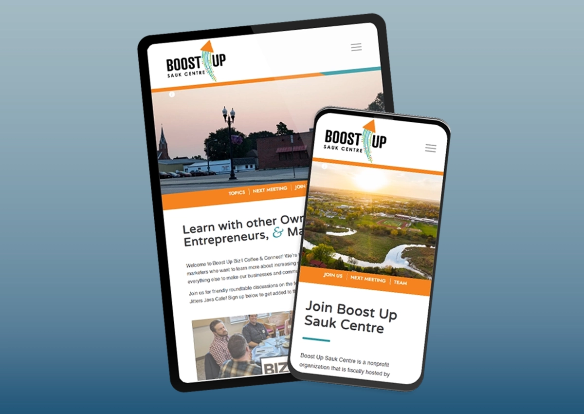
Responsive website design is an approach to website development that allows a single website to automatically adapt to different screen sizes.
Rather than creating separate desktop and mobile websites, a responsive website adjusts the layout, text, images, navigation, spacing, and interactive elements based on the visitor’s device.
Whether someone visits your website from a large desktop monitor, a tablet, or a smartphone, they receive the same information presented in a way that is appropriate for their screen. This creates a more consistent experience while making the website easier to manage over time.
Why Does Responsive Website Design Matter?
Your Visitors Expect a Smooth Mobile Experience
For many businesses, mobile visitors now represent a significant portion of website traffic.
People browse websites while waiting for appointments, sitting at sporting events, relaxing at home, or researching services during lunch breaks. They expect websites to work naturally on whatever device they happen to be using.
When a website is difficult to read or navigate on a phone, frustration builds quickly. Visitors may leave without learning about your services simply because using the website requires too much effort.
Responsive website design helps remove those barriers by making information easier to read, buttons easier to tap, and navigation easier to understand. The easier your website is to use, the more likely visitors are to stay engaged.
Responsive Design Supports Search Engine Optimization
Search engines want to provide users with websites that offer a positive experience. While responsive design is only one part of search engine optimization, it helps create a website that is easier to use across devices.
Google also primarily evaluates the mobile version of websites when determining how pages should be indexed and ranked. A responsive website helps ensure that mobile visitors have access to the same quality content and functionality as desktop users.
Responsive design doesn’t guarantee higher rankings on its own, but it provides an important technical foundation that supports broader SEO efforts alongside quality content, website speed, and overall usability.
It Creates a Better Experience for Every Visitor
Good website design is about reducing friction. Visitors should be able to find information quickly, understand what your business offers, and know exactly what to do next.
Responsive design contributes to that goal by creating layouts that feel natural on every screen size. Menus remain usable. Text stays readable. Images scale appropriately. Forms become easier to complete.
Instead of forcing visitors to work around the website, the website adapts to the visitor. That flexibility creates a more professional experience regardless of how someone chooses to access your business online.
One Website Is Easier to Maintain Than Two
Years ago, some businesses maintained separate desktop and mobile websites. Today, responsive website design allows one website to serve every visitor.
This simplifies content management because updates only need to be made once. New service pages, blog posts, images, and contact information automatically remain consistent across all devices.
It also helps reduce the risk of outdated information appearing on one version of the website while another remains current.
Managing a single responsive website is typically more efficient for both businesses and visitors.
Responsive Design Helps Future-Proof Your Website
Technology continues to change. New phones, tablets, laptops, and screen sizes are introduced every year. Building a website that only works well for today’s devices creates unnecessary limitations for the future.
Responsive website design provides flexibility by allowing layouts to adapt as devices evolve.
While no website can predict every future technology, responsive design creates a much stronger foundation for long-term usability than fixed-width layouts built for only one type of screen. That adaptability helps extend the useful life of your website.
Responsive Design Works Best With Good Website Planning
Responsive website design isn’t something that should be added after a website is finished. The best websites are designed with responsiveness in mind from the very beginning.
Navigation, page layouts, images, calls to action, forms, and content organization should all be designed with multiple screen sizes in mind. This creates a smoother experience than retrofitting an older website later.
When responsive design is treated as part of the overall website strategy rather than an afterthought, the result is stronger for both visitors and search engines.
Design a Website That Works on Every Screen
Your website should provide a positive experience, no matter how someone chooses to visit it. Responsive website design helps make that possible by improving usability, supporting SEO, and creating a more consistent experience across desktops, tablets, and smartphones.
At Blue Ox Websites & Marketing, we build responsive WordPress websites designed to perform well for both visitors and search engines. If you’re planning a new website or wondering whether your current site still meets today’s expectations, schedule a video call or call us at (320) 403-2433. We’ll help you create a website that’s ready for wherever your customers find you next.


 Blue Ox